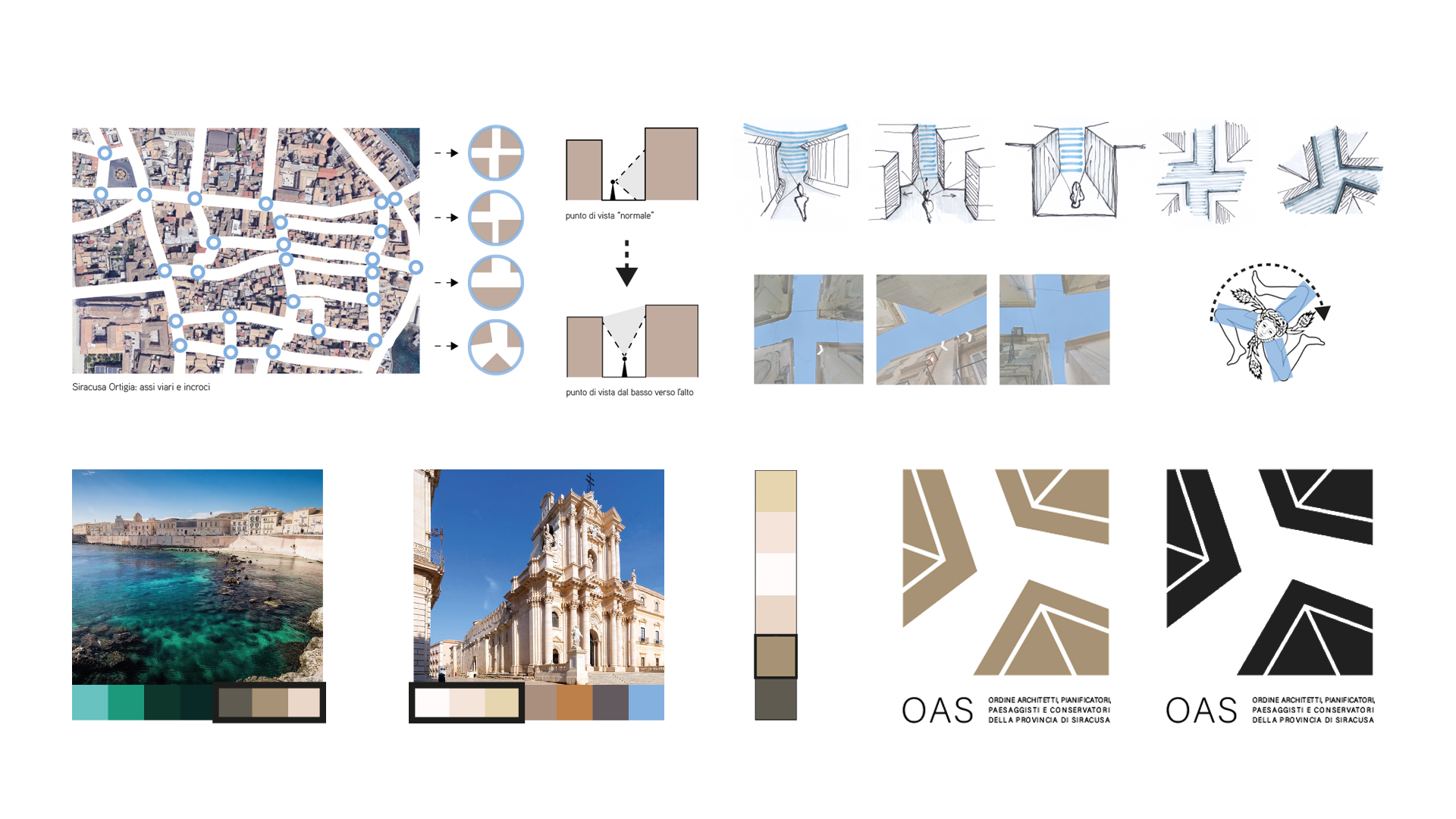
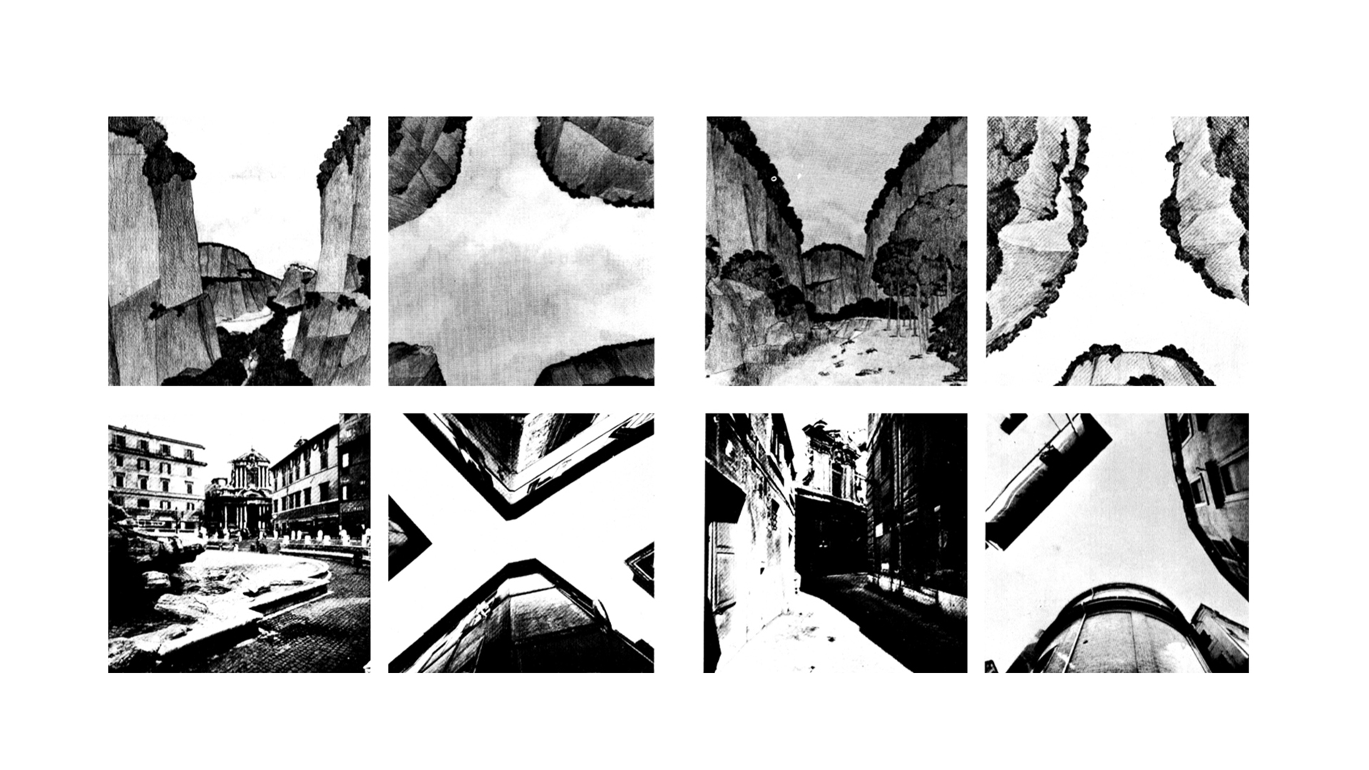
The place and the sign are two essential elements of each other, the creative process that led to the idea of the proposal was developed from a careful and refined analysis on the city of Rome proposed by Paolo Portoghesi contained in the text “Roma Interrotta” of 1978), where the architect highlights the similarities between physical and urban environment.
An attempt was made to apply this method of analysis to the signs of Syracuse, and specifically of Ortigia, by analysing the road axes and their intersections, often characterized by strong compressions due to the proximity of the building.
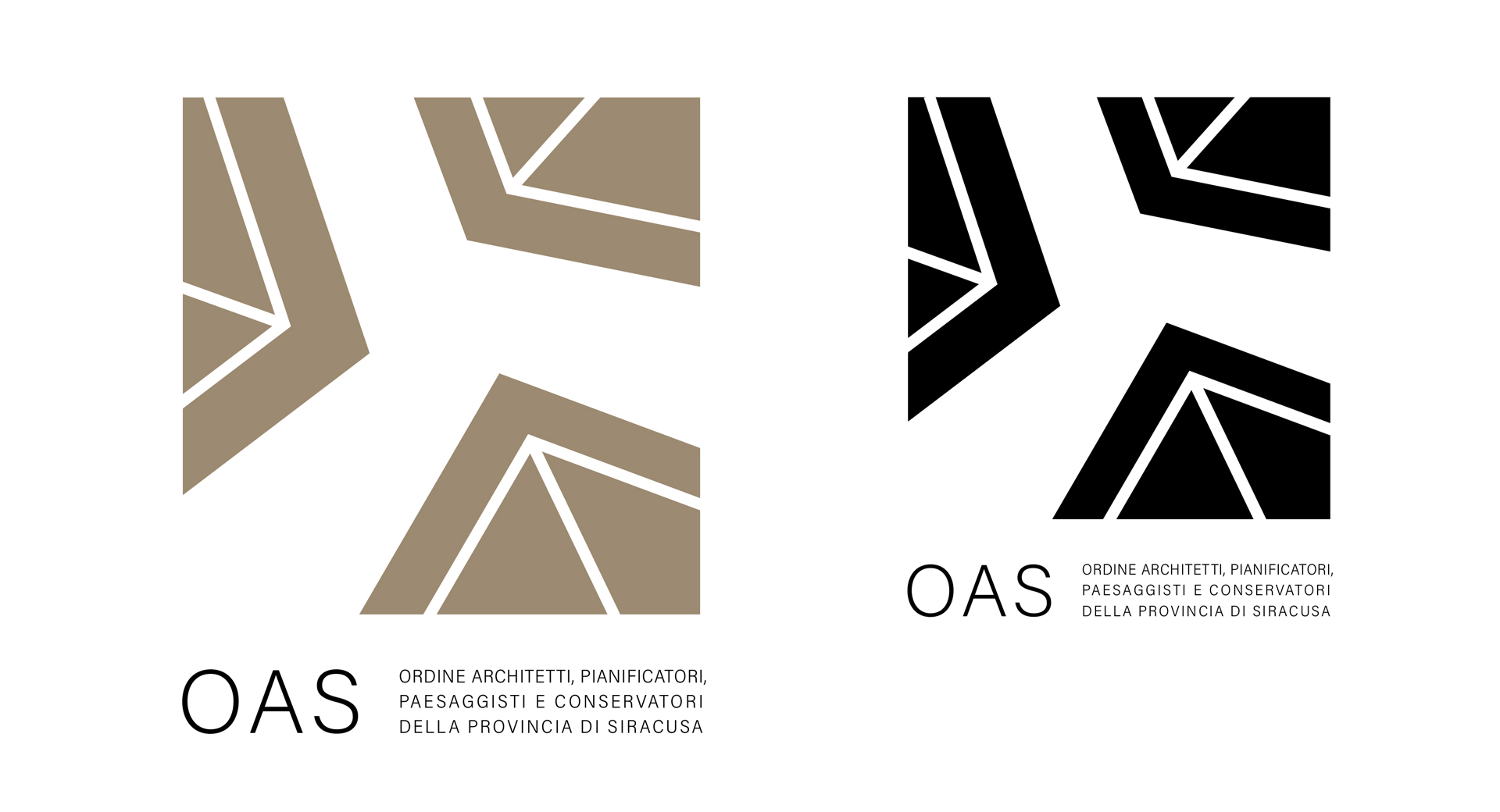
This feature has created the logo, with the particularity of changing the point of view, moving it from the height man up, where the roofs merge with the sky of Syracuse, where there are sharp edges and geometries never banal with polite asymmetry and strong chromatic contrasts.
This creative idea seemed correct to summarize the link of the Order with the territory and its history But also looking to the future thanks to a strong sense of dynamism and strength.
We use cookies to ensure that we give you the best experience on our website. If you continue to use this site we will assume that you are happy with it.OkNoPrivacy policy
You can revoke your consent any time using the Revoke consent button.Revoke consent