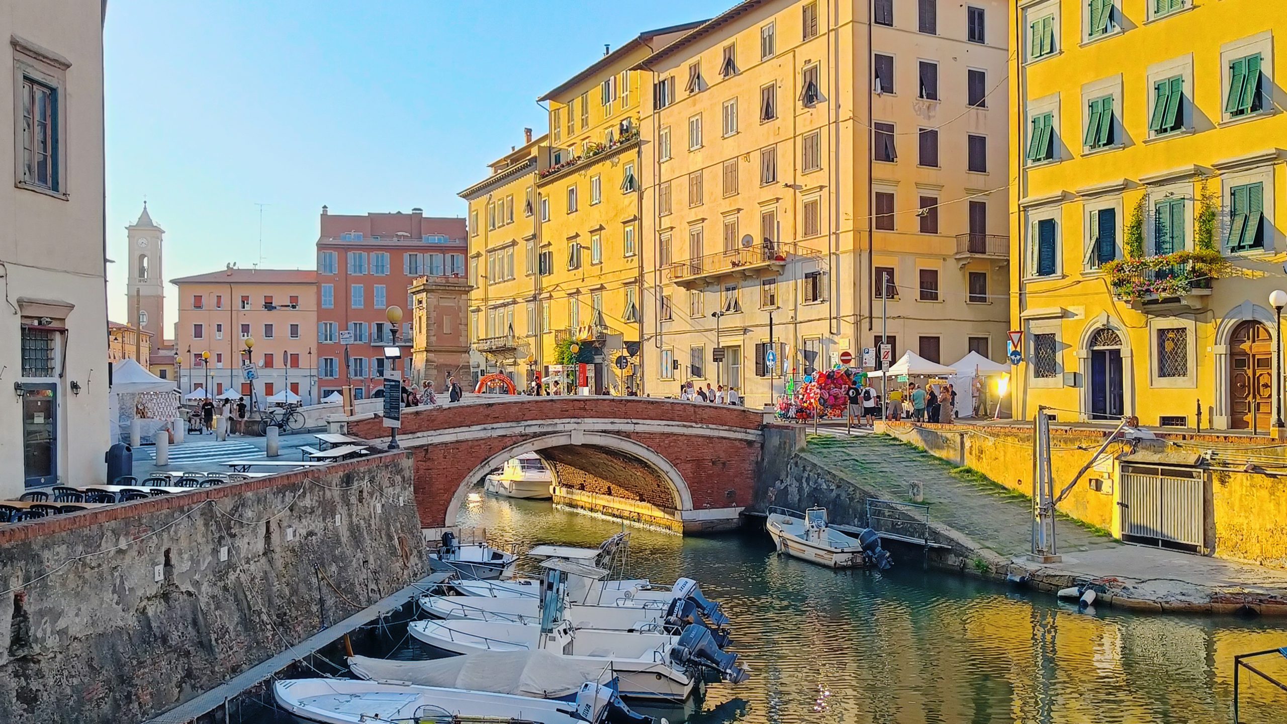
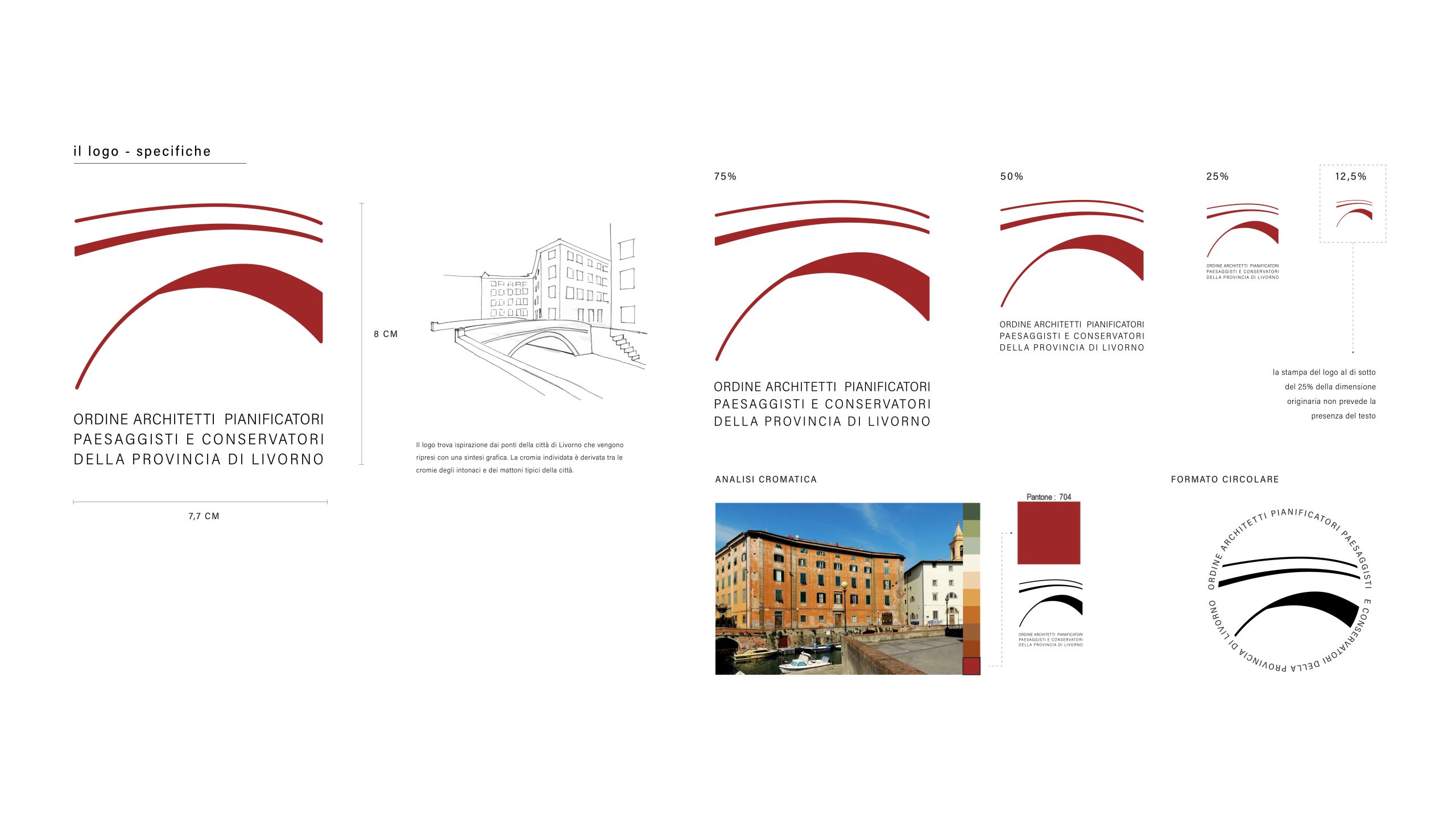
The logo was born from the intention of synthesizing in the graphic one of the most characteristic and distinctive elements of the architecture of Livorno, the bridge, unmistakable sign of Architecture has in its sign the ancient function of the connection between land and water. Its shape, gently curved, contains another fundamental of architecture, the round arch and lowered universal symbols of classicism.
It was decided to concentrate the search for the logo on the bridges and the distinctive colours of the “Venezia nuova” district, where the focus is on views and unique and characteristic atmospheres.
The logo is represented by shadows of the bridge, which gives a strong immediacy of reading and at the same time leaves room for a personal interpretation of the forms to then tend to the bridge.
We use cookies to ensure that we give you the best experience on our website. If you continue to use this site we will assume that you are happy with it.OkNoPrivacy policy
You can revoke your consent any time using the Revoke consent button.Revoke consent