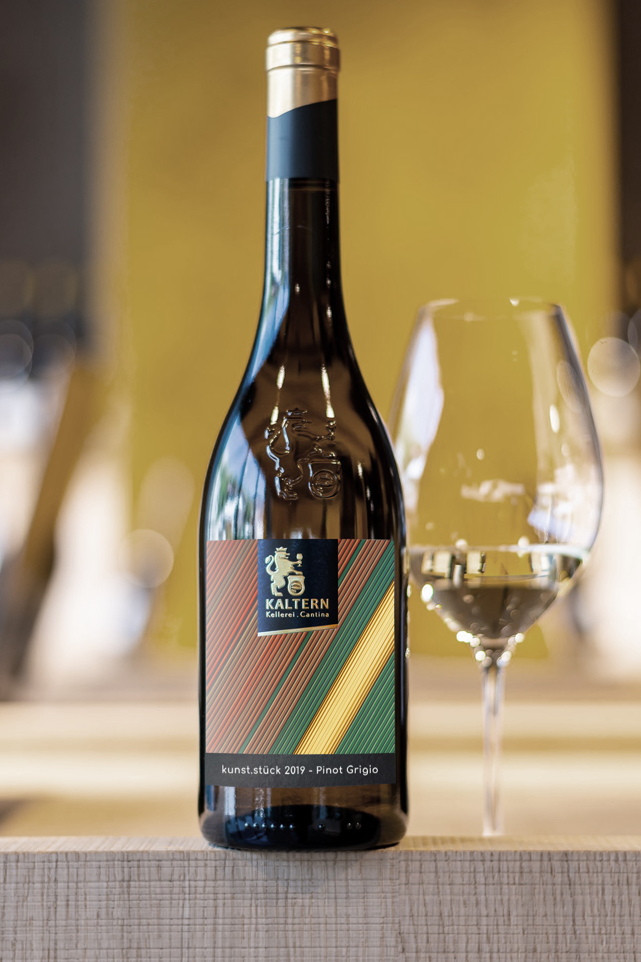
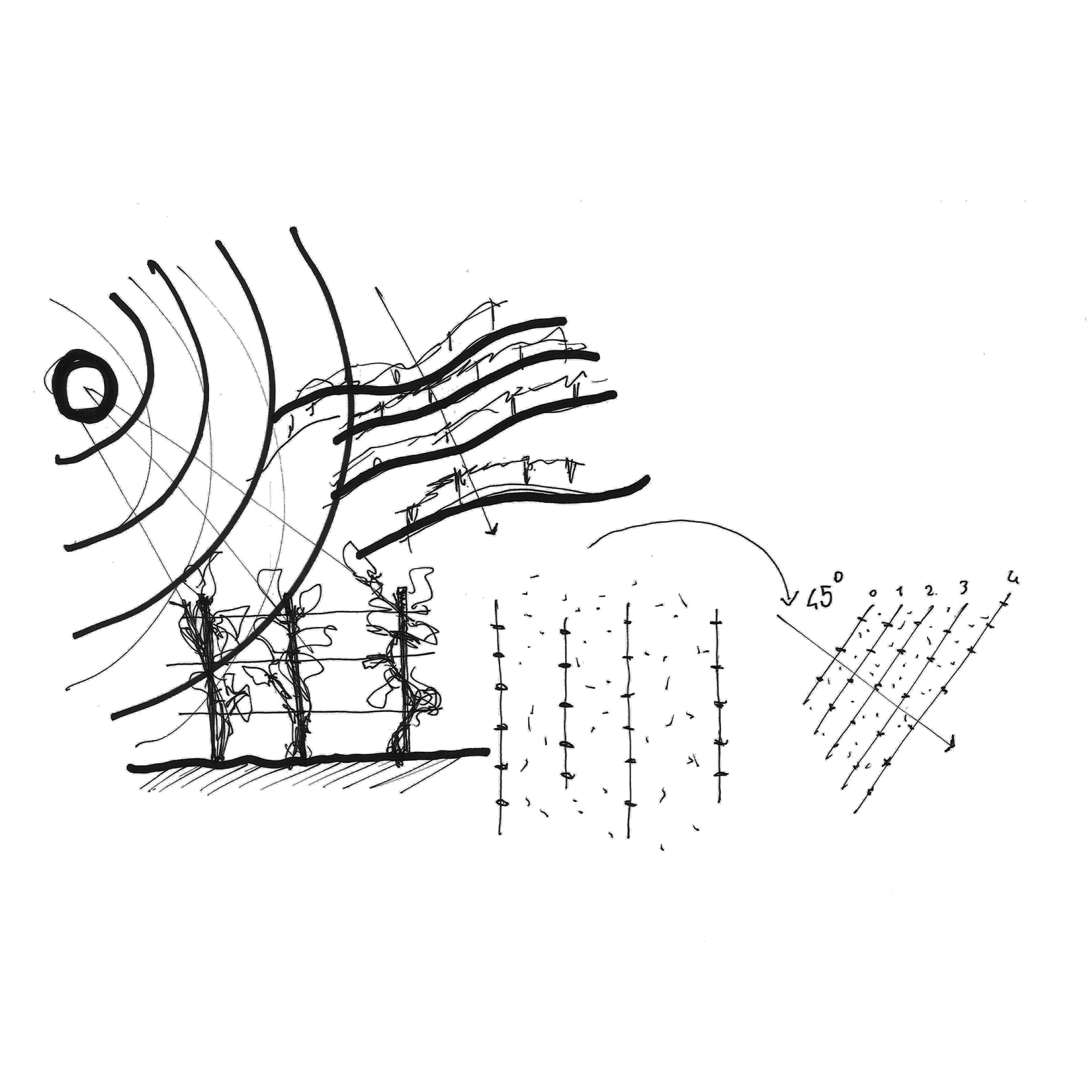
The label designed and proposed has a series of colored oblique signs that represent the rows of a vineyard, rows that thanks to nature and man’s wisdom allow the magic of wine.
It is there, between earth and sky that a vine finds its existence in an exceptional form for taste and characteristics, it is there that a great wine is born the Pinot Grigio from Cantina Kalter represented on the label by a golden row stands out among all others.
We use cookies to ensure that we give you the best experience on our website. If you continue to use this site we will assume that you are happy with it.OkNoPrivacy policy
You can revoke your consent any time using the Revoke consent button.Revoke consent